Pick a Card, Any Card
Making better choices faster using Tinder-like mobile interfaces.
What movie should I watch?
Where should I eat dinner?
Who should I go on a date with tonight?
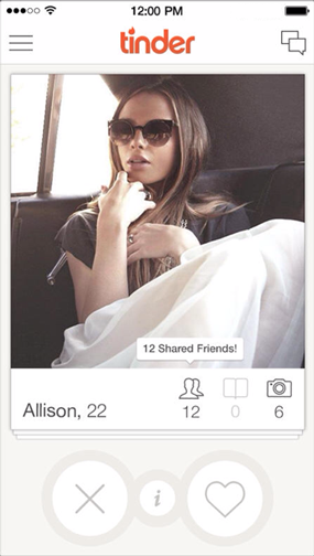
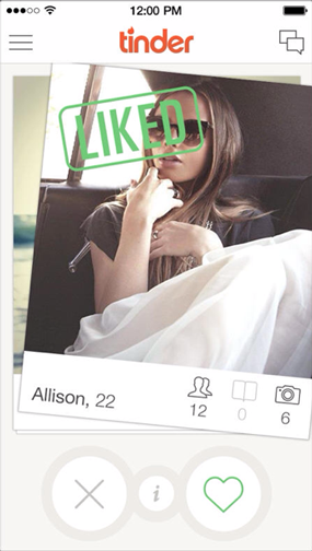
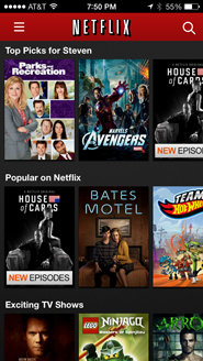
To help users answer that last question, the mobile app Tinder provides a unique card-based interface1. Upon opening the app a user sees a deck of cards, and each card shows basic information about one potential match: photo, first name, age, and number of mutual friends. The cards are already filtered by location, and the user can tap into a card to find out more about her potential date. The user can also swipe the card left if she isn’t interested, or swipe right if she is. If two users share mutual interest, they are both notified and can exchange messages through the app. Tinder is designed to help users make choices as quickly and easily as possible, and then it gets out of the way. (These are the iPhone screenshots that Tinder provided for the App store.)
Technology is not only making it easier for users to find dates, but it is also providing them with instant access to nearly every movie ever made and telling them about more restaurants than they knew existed. Users face an increasing abundance of choices in a widening variety of contexts, and Tinder-like interfaces could be adapted to help users answer questions like those above2.
Shortcomings of Existing Interfaces
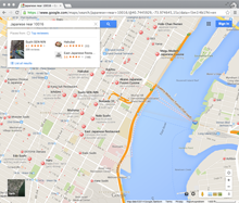
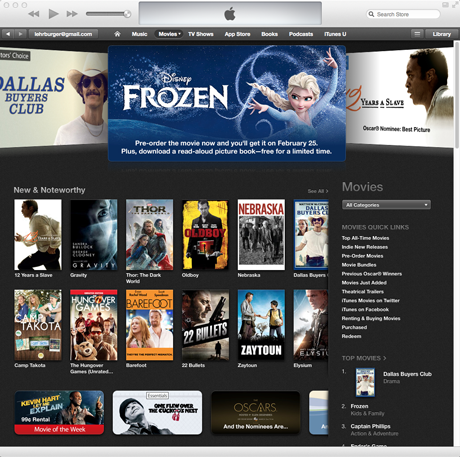
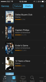
These questions — what to watch, where to eat, and who to go on a date with — all share common characteristics: there are many options, preferences are very personal, and they are important to short-term happiness. On most services, answers to these questions consist of text, images, and locations, and they are displayed in lists, grids, and maps, respectively:
When people are trying to choose what they want to do, however, these interfaces make the process more difficult than it needs to be. They provide minimal information about ten or more results at a time, and the user has to decide which warrant a closer look, or if they want to clear them all and move to the next page. Users searching from a desktop browser can open promising results in different tabs, but users searching from mobile apps have to remember their favorites for the duration of the search. The experience only worsens if the user wants to tweak the original query, since these interfaces do not keep any ‘state’ and with each revision the user is essentially starting from scratch.
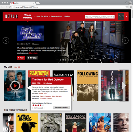
Consider, for example, a user searching for a movie to watch. iTunes offers grids and lists based on what’s popular, regardless of the user’s mood or interests. While Netflix offers some personalization, it’s still structured like a brick-and-mortar store; both the desktop browser and mobile app interfaces organize movies by genre or category on horizontal shelves.
Both iTunes and Netflix require that users do work to get more information, just as brick-and-mortar customers have to physically remove the movie from the shelf, turn it over, and read the back. Furthermore, none of these interfaces provide a good way for users to keep track of ‘maybe’ candidates while they look at more options. In the store, the user can physically carry around a handful of movies, but will either need to put them back later or ask an employee to do it for her.
Netflix does let each user keep a List of movies to watch, but this feature has evolved from the DVD rental queue, and feels more like a “list of movies to watch eventually” and less like “a way to keep track of movies to watch now.” The latter implies movies for a certain day, mood, and audience, and consequently requires a more selective process. Most users resort to the inelegant practice of opening each potential movie for ‘right now’ in a new Netflix tab, but this requires a delicate hover-move-right-click mouse maneuver and makes it easy to accidentally start playing the movie instead. The custom iTunes Store browser is even worse: it doesn’t let users open multiple tabs, and it buries its Wish List feature deep in the UI.
As another example, consider a user who wants to go to a new restaurant for dinner. Services such as Foursquare and Yelp help users make these choices, and while there is some variation between their interfaces, results are generally provided in both list and map formats. In a desktop browser, there’s enough space to show the two formats side-by-side, but on mobile users must toggle between the different views (on Foursquare, scrolling the list minimizes the map, and tapping the map minimizes the list; Yelp offers a List/Map button in the upper right).
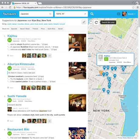
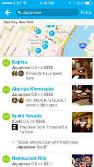
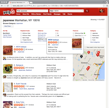
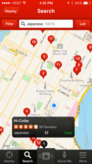
These interfaces are designed to show good options of a certain type in a certain area, but they make it difficult for the user to make informed choices, especially on mobile. While the desktop browser makes it easy to see the basic information about each venue along with where it’s located, on mobile the separate list and map views force the user to either tap through to the venue detail screen or cross-reference between the two screens in order to see where anything is.
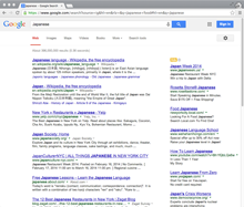
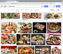
In addition, neither interface helps the user narrow down their possibilities to a single choice, and instead they treat each new query as a brand new search. For example, imagine a user looking for Japanese food on the way home from work. First she scrolls through all of the results in her initial search area near her office, and takes mental note of a few promising-looking restaurants. Then she drags the map closer to her apartment to see more results, but if the two map areas overlap and the results near her office happen to rank highly, then she’ll have to look at those same results a second time. Even worse, if she’s using the map view in the mobile app rather than the list view, she’ll have to explicitly tap each pin again to see if it’s one that she’s already looked at. Similarly, if the user decides halfway through the search that she wants ramen rather than sushi, she’ll have to look through many of the same results yet again. The entire process requires a lot of tapping, a lot of remembering, and a lot of duplicated effort. If these services maintained state for each new decision and kept track of what the user had seen, then the user would only need to look at each option once.
Decks for Decision Making
Rather than the list, grid, and map interfaces that are currently common, services could repurpose Tinder’s card-based interface to help users make better choices faster. To understand how this would work, it’s helpful to go through the flow step by step:
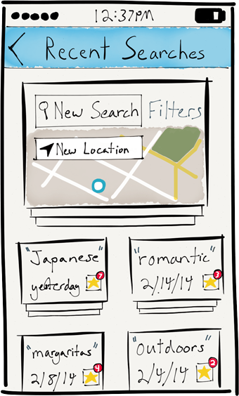
- Users would first see a text field for typing a query, and perhaps a dropdown list of suggested categories or keywords. There would also be a way for the user to see past searches — each search keeps track of its own state, and she might want to continue or return to them later. (Tinder, in contrast, groups all of a user’s activity under a single search.)
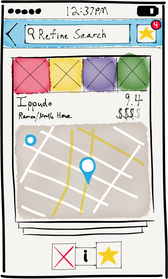
- After entering a query, the user would be presented with a virtual deck of cards, with the top card taking up most of the screen. Each would display the essential information about a particular search result, whether it’s a movie (title, image, year, length, rating, etc) or a restaurant (name, location on map, price, rating, etc).
- The user could swipe away the current card to reveal the next card, and the app would pre-load the required data so the user could move quickly. Note that a swipe gesture is not significantly more effort than that required to scroll past an item in a list interface, especially since the user, cognitively, can only evaluate one option at a time.
- Cards that were swiped left would not re-appear in the current deck, but cards that were swiped right would go to a separate deck of ‘maybes’. This deck would function much like an online shopping cart, except the user would only ultimately ‘purchase’ one of the items.
- This deck would be accessible from a button in the top bar, and the user could switch between the two decks by tapping that button. That button could also show a badge indicating the number of ‘maybe’ cards. By making it easy for the user to keep track of and review good-enough options, the app will pull her gently towards a decision.
- If the user wanted to further refine her query, she could enter in new search terms or locations. Rather than start the entire process over, the app would instead simply shuffle cards that met the new criteria into the deck. Cards the user had already seen, however, would not reappear.
- The order of the cards in the deck could also take into account a variety of more personalized signals, such as the user’s history, her friends’ activity, and her past preferences. More interestingly, the app could learn about the user’s preferences for that specific search3. It might notice, for example, that the user was only swiping right or tapping into ramen restaurants despite having searched for Japanese in general, and the app could shuffle more ramen and less sushi into the current deck accordingly. In this way the app might be able to tease out preferences of which the user wasn’t even consciously aware.
- When the user has made her choice, the app’s job is done. Depending on the type of choice being made, it should be easy for the user to begin watching the movie or to get directions to the restaurant.
Summary
Technology has made it easier for users to discover an increasing abundance of things they might enjoy, but it has not yet offered comparably improved tools for wading through this deluge of options. iTunes, Netflix, Foursquare, and Yelp are not the only services that might benefit from Tinder’s card-based interface, and users face similar choices when shopping for clothing, searching for an apartment, and choosing a book to read. By using cards to show enough information about each option for users to make a maybe/no decision, and by keeping track of which options users have seen and which they are considering, services can help users make better choices faster, and ultimately make users happier.
-
Tinder was certainly not the first app to ask users to rate a succession of items. The earliest example I can think of is the Hot or Not of a decade ago, and Pandora also offers thumbs-up or thumbs-down buttons for giving feedback on songs. These are slightly different, however, and don’t use cards in the interface. Other apps in other contexts have more recently used Tinder-like cards, such as Branch’s link-sharing service Potluck, but that was focused around content consumption rather than making choices.↩
-
Paul Adams recently wrote about the trend towards cards as general interactive containers for all types of content, and a startup called Wildcard wants to replace the mobile Internet with a library of cards designed for those devices. While these are compelling visions for the future, they are outside the scope of this post. Cards can greatly improve the user experience for certain types of choices regardless of their prevalence in other contexts.↩
-
In high school, my friends and I would spend nearly as long at Blockbuster deciding what to watch as we would spend watching the selected movie itself. Choices like these are often made collectively by groups of friends, and per-search adaptation could be especially useful in those circumstances. For example, perhaps a user loves sushi, but tonight she is eating with a friend who is vegan. It might be useful for the app to ask the user who she was with, or maybe the app could even let multiple users collaborate on the same search at the same time on their own devices with their own decks of cards… but these features lie too far beyond a minimum viable product.↩
Thanks to Nina and Bryan for their help with this post!