Where Do You Go
Customize and share heat maps of your Foursquare check-ins.
Where Do You Go provides Foursquare users with a dynamic heat map of the places they have visited on top of a standard Google Maps interface. Users can create snapshots of their maps and hotlink them as static URLs on their personal webpages, or they can use the simple WDYG wrapper pages to share their maps on Twitter. The maps will self-update automatically in the background as users continue to visit new places and checkin with Foursquare.
The idea initially came out of the difficulty I experienced in explaining to people the areas I tend to frequent in this expansive metropolis — “south of 14th Street and north of Delancey” is somewhat accurate, but really misses many of the nuances in my habits. It would have been relatively straightforward to make a static image of just my own checkins, but I wanted something that updated over time as I went to more places, and I wanted something that was also usable by other people.
WDYG was a project for the Mashups class I took last Fall, and I launched it on December 18th, just before I exhibited it at ITP’s Winter Show. Many people used the built-in “tweet this” button to share their maps with their friends, and then those friends saw those maps and wanted to create and share their own maps, and so on… this viral distribution contributed to much of the non-trivial amount of traffic the site has gotten, but I also got some decent press.
Below are two maps I made of my checkins in Manhattan and one from my trip last summer to Amsterdam (which was coincidentally one of the early Foursquare cities, although now you can check in anywhere), and there’s a fourth heat map embedded in the sidebar. You can click the maps to visit the shareable page that each one has. The heat maps will update in the background as I check into new places, but it will skip checkins from the past 12 hours to protect my privacy, and the coloring is sufficiently vague as to make it ambiguous which places it is to which I am actually going.

Users are given a variety of options for customizing their maps before sharing them: they can adjust their maps to make them ‘hotter’ or ‘colder’ if there is either too little or too much coloring, they can easily jump to another city, they can select from a variety of color schemes, they can adjust the size of the map image, and they can select from one of several zoom levels. A user can then create a ‘snapshot’ of his/her customized dynamic JavaScript Google maps that will have a static URL, and the user can then embed that .png elsewhere on the Internet or tweet the corresponding wrapper page (that has a conveniently auto-shortened bit.ly URL).
The Python code for the entire project is available on GitHub and the application runs on Google App Engine, a framework that abstracts away challenges related to server administration and scaling (i.e. worrying about getting and configuring more computers to run your application when you suddenly get a lot of traffic). It uses Foursquare’s API and John Wiseman’s wrapper library for it as well as the bit.ly API, the Google Maps API, jQuery, and Blueprint CSS.
The heat maps are created using a heavily modified version of the gheat-ae Google Code project, which is a port of the gheat Google Code project, without which I wouldn’t have known where to start (although it was mostly non-functional and un-documented when I found it). There are a few interesting things I’m doing to make the heat maps consistently attractive, so I’ll dive into the technical details a little.
Google serves their maps in pre-generated 256x256 pixel tiles, and they provide functionality in their JavaScript API for the client to overlay custom tiles on top of their map tiles. To display each overlay tile I query the App Engine datastore for the venues within that tile (and just outside of it, at a distance based on the zoom level, so that I get coloring from venues that are not within the tile but still bleed into it). Checkins are stored with the venue at which they occurred, so each venue has a latitude and a longitude and a number of checkins that the user has there (if two users check in to the same place, they each get a separate copy of the venue in the datastore). A heat map tile to be displayed on top of a Google maps tile might look like this:
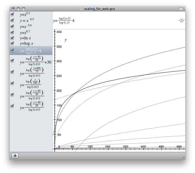
The checkins are plotted on the map conceptually as dots that are darkest in the center and fade out towards the edges, and they’re drawn mostly independently of each other (i.e. I’m not doing any expensive distance calculations between the venues). To draw the tiles the application adds all the geo-located dots together to get a ‘darkness’ value for each of the pixels in the 256x256 pixel tile. I wanted a smooth gradient from the center to the edge of the dots, even if there were lots checkins at the same venue. I used the OS X application Grapher to experiment with functions that might create the desired effect and minimize hard edges of the stacked dots. I went with something similar to the highlighted equation below and implemented it in the calc_point function in the tile generation code — here x is the distance from the center of the pixel and y is the how dark that point will be when mapped to a pixel.
Next I needed to specify the actual color chosen from the color schemes for each pixel in the tile. The pixels correspond to a color that is a certain height up or down one of the below color scheme images (the cyan-red color scheme isn’t generated from an image, but we won’t worry about that here). Both the range and rate-of-change of the colors affects the appearance of the maps.


As described above, I needed to map the array of ‘darkness’ values for each of the 256x256 pixels in a tile to a height up or down one of these color schemes. I wanted the ‘darkest’ point on any map to correspond to the ‘hottest’ point in the color scheme (at the top of the image), and I estimated what that maximum level should be (at which the color scheme becomes ‘over-heated’ or ‘blown out’ or ‘over-exposed’) by calculating the total number of checkins and the total number of venues currently visible on the entire map. Then I needed a way to scale each darkness value so that it would always show some color for a checkin (in case a user had only one checkin somewhere away from his/her other checkins) but would be slow to reach the maximum level (i.e. the ‘hot’ end of the color scheme). I experimented with log functions in Grapher and settled on the formula in the scale_value function in that same tile generation code — here x is the value of the pixel resulting from the stacked dots and y is the level which will be mapped to a point on the selected color scheme.
Please let me know if you are interested in explanations of other aspects of the tile generation or the code in general — I think the above tricks are particularly cool, but there’s lots of interesting stuff going on within the application that I’d love to talk about.
Thanks to Jorge Ortiz for the suggesting the name for the project (finding a good name is, of course, always the hardest part of anything).