Times Open
The NYT’s first API conference, with a keynote by Tim O'Reilly.
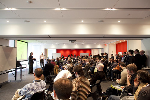
This past Friday I attended the Times Open, a day-long seminar hosted by the New York Times for developers interested in working with their newly-released APIs. Tim O’Reilly was the keynote speaker, and he gave an interesting presentation on the future of the newspaper (with slides). A few of the many notes I took (many of which I also posted on Twitter) —
- “The future is here. It’s just not evenly distributed yet.” — William Gibson
- “The central fact of web 2.0 is harnessing collective intelligence… Web 2.0 is about finding meaning in user-generated data, and turning that meaning into real services that you can deliver in real time.”
- The network as platform means that competitive advantage goes to systems that harness network effects so that they get better as more people use them.
- ‘The breakthrough on facebook that really got attention was the social graph.’
- NYTimes needs to do more conversation on Twitter
- “The bestowal of status” is a lot of what publishers do,“ O’Reilly included, reminded me of Clay saying he had a ‘magic wand’ when he was guest blogging on Boing Boing and could link to things
- Times People is currently a ghost town — just one more social network — How do API’s enable your content to be syndicated out
- Fascinated by big comment streams — 414 comments might be manageable, Joe Biden thing with 35,000 comments “What do you do with 35,000 comments besides count them?”
- We are moving out of the world in which people typing on keyboards will drive collective intelligence applications. Increasingly applications are driven by new kinds of sensors. (every laptop with accelerometer becoming an earthquake sensor through app that works similar to Seti-at-home)
- “It’s remarkable how much of our future is going to be driven by information exhaust from the devices we carry around with us.”
- Lessons from Twitter: do one thing and do it well, let others build on what you do, even if it appears to compete with you, when users innovate, support their behaviors in your platform( @, #, $)
- *If you’re really building a platform, your customers and partners may be building new features before you do.*
- Digg as parasitic on all news media, without a business model, devaluing old media
- Quote from Alan Kay: “The best way to predict the future is to invent it” and “if there’s some feature you want, don’t wait for the Times to do it; hack it.”
After the keynote, the NYT developers presented the following APIs —
- Community
- Times Newswire
- Campaign Finance
- Congress
- Article Search
- Movies Review
- Best Sellers
- ShiftD
- Times Widgets
- Times People
The one that seemed to have the most potential and significant uses was the Newswire API — it is “an up-to-the-minute stream of links and metadata for items published on NYTimes.com. […‘] Better than RSS, the Times Newswire API offers chronologically ordered cross-site results, including rich metadata.” I also thought ShifD had potential as a basis for building interesting things — it’s a tool for coherently shifting content and information between devices and contexts, and Ted Roden, one of the developers gave a cool demonstration of a quick little app that can track personal expense data in a spreadsheet using SMS messages. The Times People API also seemed to be promising, and it is built so that its content-sharing capability can be incorporated into that of other social networks. Derek Gottfrid, Senior Software Architect at the NYTimes, put it well: “Our goal is not to own the social graph — we actually have a pretty good news and information site.” Hopefully this becomes a trend in social networking websites — they should focus on applications or content (like Twitter does on communication, Flickr does with photos, or Times People does with articles) and allow themselves to be integrated into coherent user experiences. Facebook, in contrast, offers only limited integration between its own functionality and that of external sites, and keeps the user in a ‘walled garden’ cut off from the rest of the internet. I’m formulating a separate post on this topic for later.
The final presentation was from Jacob Harris, who works on the Interactive Newsroom Technologies Team. He described interactive news as “kind of like pornography — you know it when you see it, but it’s kind of hard to define” (haha), and listed three essential components: data, story, and interaction. He presented a few recent interactive pieces, including the presidential election map used in the 2008 election (which was the best and most informative available online), a confidential government document that had been leaked to the NYT and posted online with associated metadata and enhanced browsing ability, and an easily accessible database of the prisoners at Guantanamo Bay.
I had an idea about considering NYTimes.com as a one larger interactive experience, with articles and other media as the individual pieces of data, so I asked about it. Jacob said that his department ‘tried to stay small and do one off things, rather than deal with rearranging the homepage and interacting with 80 committees,’ which makes complete sense. But it reminded me that I had heard once of Google making tiny, pixel-level changes to the home page and using the behavior of huge numbers of people to determine what was the best design. I also remembered a presentation I heard at a NY Tech meetup several months ago from someone who worked at the Huffington Post — they have a real time traffic monitoring system to determine what articles on their main page are the most popular, allowing them to rearrange their content layout dynamically. I wonder if the NYT could use similar strategies to optimize their website?
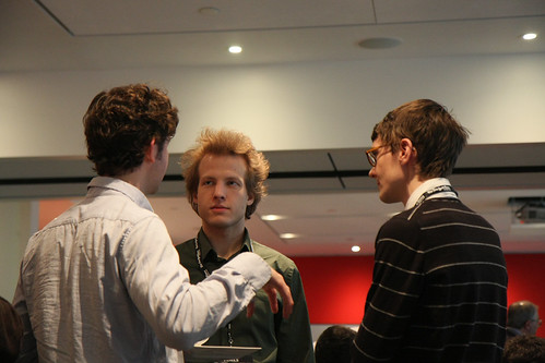
As a side note, Adam Harvey (above left), another first-year student from ITP, was at the event. Nathan (above right), whose blog I was reading last semester when I was starting to work with Processing and Scala, was there too.
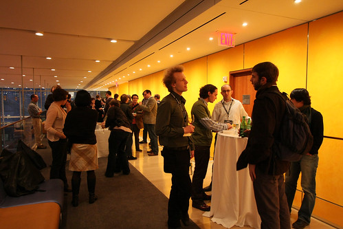
And, as a former aspiring architect, I must comment that Renzo Piano’s New York Times Building was both well designed and well executed. The lobby was spacious and inviting, the (climbable) rods along the sides filtered the light nicely and cast interesting shadows, the finishes were attractive, the spaces were pleasant and flowed nicely, and the elevators (with the floor buttons in the waiting hallways) were very cool.
Photos are from everyplace and Times Open on Flickr, thanks!


